I’m not sure if you’ve heard, but Benjamin Moore’s color of the year is Caliente. It is a spicy red with warm, orange tones and it is very bold. It looks like the design world is making a push towards warm tones this year, so I suspect we’ll be seeing a lot of red and orange in interior design in the next couple of years.

Designing with bold color is quickly becoming a trend in the interior design world. Many people, bored with the neutral grays that have been overwhelmingly popular in the last few years, are ready to add a punch of color to their world. Here are a few tips for ensuring that your bold color is right on!

Consider accenting one wall: By selecting one wall in your space to add some spicy color, you get a nice dose of boldness without overdoing it. When selecting which wall to accent, make sure it’s one that makes sense. Fireplace walls are usually a good wall to accent because they already house what should be a feature or focus of your space. If you don’t have a fireplace, consider accenting the wall that houses the largest piece of furniture in your space, or one that has a feature, like an art collage or special art or sculptural piece.

Don’t forget your 5th wall: If you know me, you know I’m a huge fan of accenting ceilings, particularly those with built in architectural features such as conferred ceilings or tray ceilings. Even if your ceiling is plain, choosing a bold color for it may be just what it needs. Remember basic color rules of thumb, like cool colors make a wall feel like it’s going away from you, while warm colors makes a wall feel like it’s coming towards you. Therefore, a tall, two-story family room ceiling can withstand a bold warm color to help bring it down while a short ceiling (like a basement bedroom for example) would do better with a bold cool color.

Be careful with bold primary colors: Proceed with caution if your favorite color is fire-engine red or bold, bright yellow, as painting walls in these colors can make your space look childish. But don’t fret, it can be done, if done carefully. Just consider painting your other walls white or ensure that there are plenty of wood tones throughout the space, to balance out the color. This can give your space a very modern feel.

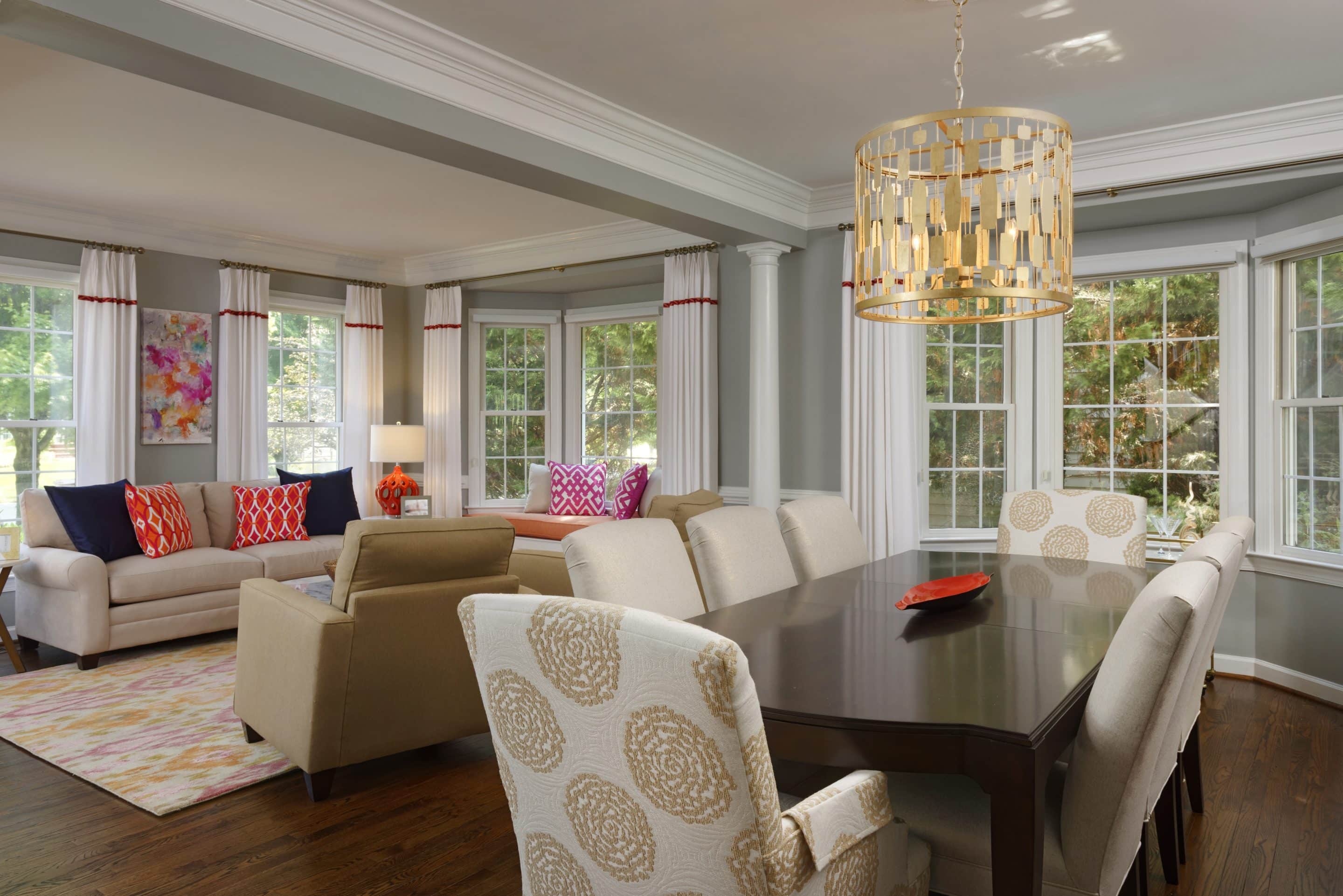
Consider being really bold with just accessories: Perhaps you aren’t quite ready to commit to bold color on your walls but still want to add some life to your space. Consider keeping your neutral upholstery and walls and adding a very bold pop of color in your accent pillows and accessories. Be really bold by selecting only one bold color option, such as bright yellow or vibrant turquoise. Or combine two to three complimentary colors such as purple, turquoise and lime green or yellow and navy blue for a coordinated bold pop.

With careful planning, you can surround yourself with an amazing splash of color that will give your decor a fun, stylish kick this spring.
If you need assistance with creating a bolder color palette for your home, please don’t hesitate to reach out. We are now offering a VIP Day service that provides you with a budget-friendly design of two to three spaces. We can utilize this service to provide your space with a fun, new updated feel and ensure that your color scheme is exactly as it should be. Find more details on our VIP Day Service here or contact us for a complimentary phone call to discuss how we can help you update your space with this budget-friendly service.